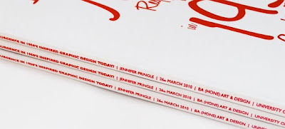
Showing posts with label 2010. Show all posts

Friday, 28 May 2010

Better luck next time

Being ultra competitive, I was desperate to win another design award but it turns out that this year is not my year. But all is not doom and gloom. I feel remarkably ok about not making it this time. For I know that what I produced, I had produced from the heart with pure blood, sweat and tears so I've no ifs or buts or I wish...

And so, here's the work that sadly didn't make it but I still love it.


To give you a bit of background, the D&AD/Quaker Oats brief was to design packaging for a new product range of chilled creamy oats for young women looking for a healthy yet delicious snack.


I established that there were many great things about this new product, in fact it was truly "Super". Officially a superfood the snack is packed full of supergrain goodness, it's super low in fat compared to its competitors and super tasty with a range of 4 delicious flavours. I therefore thought what better name than "SUPER OATS".


Giving SUPER OATS a feminine, fashionable and friendly feel, I wanted to make eating oats a fun and pleasurable experience and something young women would want to be seen eating. Available in a transparent pot, the creamy oats would be seen before your very eyes enabling the consumer to see the super grain goodness and making the product feel honest. The shape of the pot is unique, available in a lovely tactile rounded pot that oozes femininity and friendliness. The objective was for the friendly oat icon to become synonymous with Quaker Oats. The application of colour, pattern and graphic provides a fresh, vibrant and happy design language that overthrows the perception of oats being boring and bland.


Anyway, enough rambling from me. I hope you like. And who knows, maybe someone else might like to run with this?!

Saturday, 27 March 2010

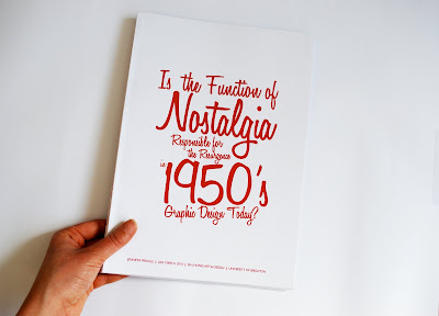
Dissertation - done.


Well I never thought I'd see the day. Dissertation handed in. I don't do acetate and plastic ringbinders - ooh, gives me a funny turn just thinking about it. So here we have my perfect bound copies in their glory. Hopefully the examiner will be so taken aback by the covers that the rest will pale into insignificance - wishful thinking.

Well, this is my first weekend in a long time with absolutely no work to do whatsoever - what will I do with myself?!

Saturday, 23 January 2010

Things are looking bright

As a graphic designer, style and colour is inspired and influenced by everything around us; society, fashion, technology, politics and more. I've been looking at the Pantone fashion colour report for 2010 and with Spring around the corner, I can't wait to see a bit more colour. Going through my inbox, Flickr and my pile of magazine tear outs, I'm excited about the colours we're going to be seeing this year. In what have been doom and gloom times, it's not surprising to know we'll be seeing splashes of sunshine to brighten our mood. We're going to be seeing dependable neutrals together with the brights of spring and they'll be warm and optimistic. Below are a selection of things I've had my eye on which will give you a feel for some of the lovely colours we'll be seeing more of as we approach the warmer months!

Vases by FxBallery.

Kitchen Utensils Print by Pat Edgeley of Antigraphic


Photography by the multi-talented Danielle T.